Photoshop : Making of an Interesting Wet Web Scene

0 comments

Preview of Final Image

The texts and images are copyrighted to 10Steps.SG and their respective owners. You CANNOT copy the whole tutorial, either in English or translate to another language.
Create a document of size 800×500 pixels. Download the macro grass from SXC.hu. Place the image into your document similar to what I done below.
Create a Levels Adjustment layer and key in the settings as 23, 0.72, 255.
Create a Gradient Adjustment layer and use the settings as shown. The colors used in the gradient are #60B0D6 and #00FFAE.
Select Brush tool and set the Diameter to 2px, Hard Round. Using white as foreground color, draw the basic shape of the web. The trick here is to hold down Shift key while drawing, so the lines will be straight.
In cases where you need to create small curves, use the Pen tool. Draw the paths and stroke it with same Brush settings as earlier step.
Once you are done with the drawings, set the Web layer to 40% in its Opacity.
Let us move on to the Brushes Palette. Click on Brush Tip Shape, select Hard Round 9. Also, check on Spacing and set it to 200%.
Select Shape Dynamics and set Size Jitter to 100%. Make Control to Off as well.
Create a new layer above the web and name it as Droplets. Now comes the fun part. With the Brush settings you made earlier, draw along the web lines. You can find circles appearing in various sizes on the web.
Right-click on the Droplets layer and choose Drop Shadow. Enter the settings as shown below.
Check on Satin effect and enter the settings as shown below.
Check on Bevel & Emboss effect and enter the settings as shown below.
Check on Inner Glow effect and enter the settings as shown below.
Check on Inner Shadow effect and enter the settings as shown below. Hit OK to close the Blending Options window.
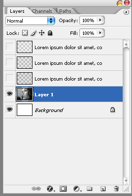
CTRL+left click on the Droplets layer to load selections around all the circles. Select the Web layer and create a Layer Mask with the selection.
Finally set Blend Mode of the Droplets layer to Multiply and we are done! Hope you have enjoyed this post. Feel free to drop me a note anytime if you have any suggestions for the next tutorial!

Read More »

Photoshop : Pattern/silhouette tutorial using a layer mask

0 comments

Step 1: Open your image. Duplicate the background layer and give it a useful name. (I named mine 'olsen, threshold'.) Save to PSD to get your working file established.
Step 2: Make sure your new layer (not the background) is highlighted and run menu optionImage » Adjustments » Threshold... The default value in the Threshold dialog box is 128. For this image I increased it to 151 and, satisfied with the way it looked, pressed OK.


At the end of step 2 you should have something resembling the image to the left.
Step 3: With the threshold layer highlighted, run menu option Filter » Stylize » Diffuse...Select Anisotropic mode and press OK.
Step 4:Run menu option Select » Color Range... Use the eyedropper to sample the black portion of the image, then run the Fuzziness slider in the Color Range dialog box up to 200. Press OK. The black portion of the image should now be surrounded by marching ants.
Step 5: Run menu option Select » Save Selection... Give the selection a name and press OK. Press CTRL-D to deselect. We'll reload the selection later.
Step 6: Make a new layer on top of the others. Select the Paint Bucket tool. Set the tool to fill with a pattern rather than a color and fill the new layer. I used one of Photoshop's built-in patterns. You may use any pattern you like. (See the Layers palette at the end of step 6.)
Step 7: Make another new layer on top of the others and fill it with white. Add a layer mask to this layer by pressing the Add Layer Mask button on the Layers palette.
Step 8: Run menu option Select » Load Selection... Choose the selection you saved earlier from the dropdown menu in the Load Selection dialog box and press OK.
Step 9: Run menu option Edit » Fill... Fill the selection with black (which should correspond to your current background color if the mask layer is highlighted). Though you've filled the selection with black, you won't see black in the image. What you should see is the pattern fill from the layer below showing through where the selected mask was filled. Press CTRL-D to deselect. (See the Layers paletteat the end of step 9.)


At the end of step 9 you should have something resembling the image to the left.
Step 10: With the mask layer still highlighted, select the Brush tool and choose a large, hard-edged brush. (I used the size 19 brush.) Painting on the mask with white as the foreground color, paint over those parts of the image you might not need, assuming you see extra stuff that doesn't need to be there. In this case, I cleaned up the lower part of the image. Here's my image after cleanup.
Adding text which shows the same properties as the image is done in much the same way the image itself was made.
Step 11: Select the Text tool, get a font you like and add some text. I chose Porky's andadded a silly comic sound effect word to the image.
Step 12: Run menu option Select » Load Selection... The correct entry will already be selected by default in the dialog box, so just press OK. The text should now be surrounded by marching ants.
Step 13: Turn off visibility of the text layer. The text will disappear but the marching ants will be left behind. (Deselecting right now would be bad.)
Step 14: Highlight the mask layer and make sure the mask portion of the layer is selected. Run menu option Edit » Fill... Fill the selection with black (which should correspond to your current background color if the mask layer is highlighted, just like the last time we did this). Once again the pattern fill should show through the mask, making the text look just like the rest of the image. Press CTRL-D to deselect. (See the Layers palette at the end of step 14.)
Step 15: Save the PSD, then Save For Web in your preferred format, and you're done!


Here's the final image...

Translation note: The Diffuse (anisotropic) filter may make translation difficult, but you might be able to replace the use of that filter with Gaussian Blur, which I think is more widely available. When I tried using Gaussian Blur it didn't work particularly well due to my source image being relatively small. If you use a very large, high quality image and leave it at the very large size while working on it, Gaussian Blur may work well.

Read More »

Photoshop: convert to a text montage.

0 comments
Alright, now, we’re going to convert it to black and white. Wait! Don’t you dare click that Image>Desaturate tool! While that will convert it to black and white, you lose countless amounts of quality and exposure when you do that. The real way to convert it is to go to Image, then Adjustments, and then Channel Mixer. This let’s us have precise control over the conversion.
Alright, a box will pop up once you click Channel Mixer. Make sure the Monochrome box is checked. These are the settings I used, but you can mess around until you get it how you like. Ideally, we want clearly defined highlights (the lightest parts) and shadows (the darkest parts).
Alright, now you need the text that will make up the image. Your design might call for a specific text (once I did a design for my youth pastor, and I used the first 10 chapters of the Book of John), but for now, go to http://www.lipsum.org and generate some random but normal looking text. I used 20 paragraphs. This should do it..
Now, grab your text tool (T), and drag a rectangle over the entire image. Now, once you let go, a box at the top below the menu options should appear. We’re going to use the font Arial, size 8. Now, paste the text you copied into this field. Because we copied paragraphs, you’re going to see some space. Just click at the end of a paragraph, and hit delete twice to get rid of it. If you need more, just copy some more text and paste until the whole screen is covered. Once you have done this, we have our text over all the image, like we need. One final thing: go to Window, and then click Character. Now you have two tabs in the box that appears: Character, and Paragraph. Make them look like this:
This is just making the text closer together, and evenly spaced. Fine tuning…
Ok, now duplicate your text layer twice. This might take some time, so just let photoshop do it’s work. On the bottom of the three text layers, the text should be black. The middle text layer should be a middle grey, like #7F7F7F. You can change the color in the Character’s box we opened earlier. The top text layer should be a light grey, like #C5C4C4.
Rasterize all three text layers by right clicking, and then selecting Rasterize Type in the pop up menu.
Ok, now in the Layers palette, make the text layers invisible, by clicking the eye. Select Layer 1, your person or item.
Now, go to Select>Color Range.
From the Select drop down box, choose Shadows. Click ok. Now, you have the Shadows in your image selected. We want to keep these. With the Lasso (L) tool selected, Right Click on your image, and choose Select Inverse. Now click on your first text layer. Make it visible again. Hit delete. Deselect the selection Right Click, Deselect, or Ctrl-D . Remember, when you are selecting the color range, only Layer 1 should be visible. When you go to delete frrom the text layer, make sure it’s visible.
Now, Select your middle text layer, and repeat this process, but this time choose Midtones in the Color Range. Then do this again for the top most layer, but choose Highlights in the Color Range
Now you have all your text layers. Make Layer 1 invisible, and there you go :) A photo montage made of text.
There are so many variations that you can do with this technique, you just need to explore and mess around with it.. Here is the one made for my youth pastor. I played around with this one for about two hours to get it how I like it. Take the time to change simple things, like converting it from color to black and white. That step is critical, so play around with it.
- See more at: http://www.adobetutorialz.com/articles/215/1/Creating-A-Text-Montage#sthash.IHMBXnrJ.dpuf

Read More »

Photoshop: Skull Face Tutorial

3 comments
This composite is put together using a primary figure image, a selection of skulls and some ‘flesh’ textures:
Skull Face Photoshop Tutorial 1

PREPPING THE FACE

The first step is to find a suitable stock image for base figure; it’s worth selecting a portrait style pose, facing straight on; this will make life easier when matching the skull stocks. For the example piece, Ive used an image by MinorphicPhoto (DeviantArt).
Start off by removing the background from your base figure – I used a Layer Mask and the Pen Tool. Check out our Pen Tool Background Removal article if your not familiar with this technique. You may want to pull in a new background to start adding a sense of mood, I used some film textures from Lost&Taken.com.

LOSE THE EYEBROWS

Eyebrows usually get in the way with this type of work, so it’s a good idea to get rid of them! This process is very straightforward, simply use the Patch Tool (J) to draw a rough selection around the eyebrow, and then click and drag to a clear area of skin – this will ‘content-aware’ fill the eyebrow area and usually works quite well. Repeat for the second eyebrow.
Skull Face Photoshop Tutorial 2

EVIL EYES

You may want to tweak the stock model’s eyes to ramp up that evil aesthetic. I used a little technique here involving duplicate layers and Screen Layer Mode. I’ll be doing a seperate tutorial on this style of eyes in the near future – so stay tuned for that one!!
Skull Face Photoshop Tutorial 3

MUTE SKIN TONES

Chances are your stock model will have a healthy skintone like our example gentleman.. A tweak of the skintones will help match the muted colours of the bone and also contribute to the macabre nature of the work. Create a new Layer Group (Ctrl/Cmd+G), and within the group use Adjustment Layers to work with the skin tones.
I used a couple; Curves, Colour Balance and Hue/Saturation. For your own piece, use your preferred method to drain some of the life out of those cheeks! Once you are happy with the overall skintone, add a Layer Mask to the group that contains your Adjustment Layers and Invert the mask to Black (Ctrl/Cmd + I).
Create a selection based on your stock model base layer (Ctrl/Cmd + click layer icon) and fill that selection with white on the skintone Layer Group Mask. This will apply all your adjustments to the figure only, and not the background. Your layer stack may look something like this:
Skull Face Photoshop Tutorial 5
Before and after our skin muting adventures:
Skull Face Photoshop Tutorial 4

DEM BONES

Now it’s time for a bit of ‘bone work.. If your lucky, you may find just one skull image that fits nicely with your base stock – that wasn’t the case with me!! Here are the skull stocks that I used to construct the example piece.
Skull1 from my HD, Skull2 by Aleuranthropy (DeviantArt), Skull3 by TheManface (DeviantArt)
Skullface Photoshop Tutorial 6
Whatever skulls you are working with, perform a background removal on each stock image so you are left with the skull only.

CONTORTING THE SKULL

Place your skull over the stock base layer; you may want to temporarily switch your skull to Overlay Layer Mode, so you can see how it ‘fits’ the face. Use the Distort Transform (Edit > Transform > Distort) to contort the skull stock to fit the model’s face. Once happy with the position, you may switch the Layer Mode back to Normal.

BLENDING ELEMENTS

This step arguably represents the true ‘art’ of the walkthrough. Add a Layer Mask to your skull layer(s) – invert the mask to black (Ctrl/Cmd + I) and then paint the skull elements back into the image using a large Soft-Edged Brush (B) set to white. In the screenshot below, all skull layers are set to Normal Layer Mode:
Skull Face Photoshop Tutorial 7

SOFT LIGHT / OVERLAY

Aside from using Normal Layer Mode, Soft-Light and Overlay are also used for more subtle bone effects. Using the techniques outlined above, ‘paint-in’ skull elements over your composite – but try using Soft-Light and Overlay modes to achieve a more restrained look. A new Layer Group for your skull elements is always helpful to keep things organised. Here’s the layer stack showing all the skull elements and their respective Layer Modes / Opacity:
Skull Face Photoshop Tutorial 8

SLAUGHTER SKIN

A selection of gore stocks were used for the decomposing skin effects, these elements were sourced from the Resurgere Slaughter Pack (DeviantArt)
Skull Face Photoshop Tutorial 9
These flesh elements were blended using Layer Masks and set to Soft Light Layer Mode. Each of the gore layers were desaturated (Shift, Ctrl/Cmd + U), the desaturation basically stops the red tones overpowering the composite – but this is down to personal preference. The Layer Group containing the flesh elements:
Skull Face Photoshop Tutorial 10

FINAL ADJUSTMENTS

To darken / accentuate contours and recesses – use Levels Adjustment Layers to reduce brightness, set the mode to Soft Light and selectively paint in using the masks. In the example I also created a new layer (set to Soft Light), and painted with a dirty yellow colour to take the greys out of the cheekbones. Little touches, but well worth the effort:
Skull Face Photoshop Tutorial 11

THE RESULT..

For the final version, I ran our new ‘HD-Raagghh’ Photoshop Action through it, and it spat out this beast:
 Skull Face Tutorial 12

REVIEW

I hope you enjoyed the first entry in our new series – be sure to tell your friends!!

Read More »

फिफा(FIFA ) वोर्ल्ड कप २०१४ ब्राजिल खेल को समय तालिका (Nepali time)

0 comments
Watch a schedule of Fifa world cup 2014 Brazil (Nepali time)


Read More »